The Enchantment Window Manager:
A Wearable Computing User Interface
White paper v1.0 by Edward Keyes, August 24, 2000
Introduction
A wearable computer needs a user interface which is distinct from that used on desktop systems. This is because the input and output methods are different, because the user attention is different, and because the tasks are different.
On a desktop machine, a full keyboard and graphical pointing device are usually available, and the output device is a large monitor. The user is fully attending to the task at hand, and may in fact be working at the computer for hours on end. The tasks are typically lengthy or complex, and are rarely related at all to the user's surroundings.
In contrast, a wearable computer has a minimal input device, an 18-key Twiddler being about the best that can be hoped for, with a nonexistent or minimally functional pointing device. The output device is a heads-up display, competing for attention with the user's surroundings and rarely better than the equivalent of a 6-inch monitor. The user may be trying to operate the wearable while in the midst of other activities such as conversations, and thus the primary uses are augmentations, quick transactions which are closely related to the real-world task the user is trying to accomplish.
In this document are some general user interface guidelines and a description of the Enchantment window manager, which is a proposal for the overall structure of a practical wearable user interface. Much additional work will need to be done in properly designing applications to run within this environment, as well as in the actual implementation. However, it is hoped that with the high-level behavior set, application design will be a well-defined and compartmentalized problem.
Design Boundaries
Wearable computing encompasses a huge range of hardware and applications. Everything from a wristwatch to a complete reality-mediation system is a wearable. Designing a generalized user interface which will scale in a comprehensible manner across this incredible range is a very hard problem and perhaps an impossible one. Thus, to find a task which can actually be tackled, it is necessary to delimit the design arena a little more carefully.
The area of concentration of the Enchantment system is a wearable platform buildable today and optimized for the typical tasks of an experienced user in everyday situations. That is, this project is explicitly ignoring the problems of casual or novice users or users with specialized needs. The reasons for this are twofold: such users would be better served by more targeted interfaces with other design goals, and it makes sense to first design a user interface suitable for the largest fraction of early adopters of wearable technology.
Thus, the Enchantment project assumes that the imagined wearable hardware includes both a heads-up display and an input device suitable for text. This is in contrast to an audio-based wearable or one with a limited control scheme (such as just a clicker or cursor pad). The archetype to have in mind is a wearable with a quarter-VGA screen and a Twiddler, although generalizing to other display sizes or other input devices is not difficult, so long as both are suitable for reading and entering free-form text, which is chosen as a minimal cutoff for a usable general-purpose computer system. Note that Enchantment does not require a graphical input device unless specific applications are designed to use analog input.
To reiterate, this project is specifically targeted at "everyday" wearable users: that is, people who do, or want to do, enough important tasks on their wearable that they are willing to put up with the hassle of carrying it around all the time (as opposed to putting one on temporarily for a museum tour and therefore needing to learn its interface in thirty seconds or less). Once the early adopters are happy and productive, it will then be time to design interfaces for the rest of the world, based on the experimental results from the initial round.
It might be asked why not just skip this initial step, and design a user-friendly interface for your grandmother's wearable from the start? Isn't targeting early adopters too narrow and easy of a task? To that is can merely be countered, well why hasn't anyone done it yet? So far wearable computing pioneers have labored under poor interfaces hastily ported from the desktop environment or whipped up for single specialized tasks. The job of designing a suitable general-purpose interface for this group of people and their tasks is more than enough of an interesting problem by itself without also attempting to design a unified interface for every possible wearable user and every possible wearable device.
General Use
The Enchantment system makes the assumption that the user will remain in primary control of the system at all times. This is in contrast to a context-driven system where tasks are initiated by the state of the user's environment ("I want to go home, show me how to get there" versus "You have left your office, now follow these directions to get home"). Context-sensitive agents are given instead a background role, offering hints and reminders but never growing into a controlling influence. This design decision was made primarily because the field of context sensing is relatively new: it makes sense to gain some experimental results with such agents in a background role before making the assumption that they will be reliable enough for task control.
The system revolves around one primary task at a time. Humans have one thread of consciousness and therefore at any given instant will be concentrating on only one job. The advantage of traditional multitasking user interfaces is not so much to allow the user to concentrate on multiple tasks at once, but to alleviate the overhead in task-switching: it is much easier to just glance at a second window than to navigate through a task manager to switch modes.
Unfortunately, the available screen area in a heads-up display is very limited, so a traditional desktop windowing system is not very suitable. Enchantment must therefore compromise between ease of task-switching and the efficiency of the primary task. The design of choice reserves approximately two-thirds of the screen area for the primary task and compensates by making task-switching between recent and future tasks very quick.
The general idea is that at any time the user may "table" the current task and switch to another one, then instantly return by "popping the stack" of recent tasks. In practice it is expected that users will juggle only a handful of tasks at one time: more than that will tend to exceed short-term memory. Returning to a task which was last worked on an hour or more ago is seen not so much as popping the stack, but starting a fresh task with old data.
In addition to primary and tabled tasks, there are background agents which will on occasion need to notify the user of new or changed information: low-battery warnings, for instance, or incoming email. The majority of the remainder of the screen area is reserved for these agents, which can thus present notifications to the user without usurping the primary task. The user can mentally task-switch to consider the meaning of a notification without taking any action other than moving the eyes. The distinction is that the primary task is "what I'm doing now", and the rest of the screen area is "what else is going on".
In general, the Enchantment system is designed to avoid the simultaneous use of both hand and eye except where such combinations are required by the task at hand. This is the reason why it does not rely on a graphical input device or cursor pad: moving a pointer to a spot on the screen requires an extended feedback process between hand and eye. Instead, Enchantment relies on command keys: one first sees where one wants to go or what command one wants to activate, and then can look away while carrying out the keystrokes necessary to accomplish it. The holy grail for Enchantment is a user interface capable of being navigated while carrying on a conversation at the same time. Quick glances at the display and short command sequences are a necessity for this.
Screen Layout
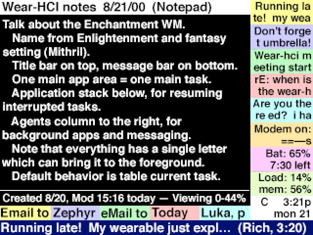
The above graphic is a mock-up of an Enchantment screen. It is not intended to represent the final implementation form, but merely a sample of the general features of the environment. Here the emphasis is not so much on the visual aesthetics but on the behavior, although this particular example is also created to show the approximate pixel count of a quarter-VGA screen and the general size of readable text on such a screen.
The black-background area, taking up approximately two-thirds of the screen area, is the primary task region. Its contents are under the control of the individual application, and may or may not follow the overall design guidelines of the rest of the Enchantment environment.
The white-background region above the primary task region is the title bar. This is intended to remind the user of the task context they are currently working in. Its contents are under application control, but are restricted in format since this information will also be used for identification of the task for switching purposes.
The colored bars below the primary task area represent the task stack. This is a Start-bar-like interface construct which gives brief summaries of all tasks currently tabled. The bars will resize as more or fewer tasks are added to the stack, and are arranged from left to right in the order of most to least recently accessed. Above some number of tasks, the system will start to automatically quit old tasks which do not require further user intervention to safely shut down (i.e. ones without unsaved data, for instance).
Note that each tabled application has a single unique letter capitalized in its name. This is to allow that application to be quickly brought to the foreground with a key command. Tasks can also be identified by their position in the stack, and in this particular sample visualization the slots are color-coded to facilitate this (green is always third, so no time need be wasted by counting slots).
The colored bars on the right side of the screen represent the agents column. Here are brief summaries of background processes and notifications. As a new message is generated by an agent, it appears at the top of the column. There is a priority mechanism for determining what old entry simultaneously disappears from the column. System status information like the pictured load meters are generally given low priority, so they will only take up screen area when there is no significant queue of incoming messages to deal with.
As with the task stack, each entry in the column has a unique letter which can bring it to the foreground, tabling the current primary task in the process. Likewise, an alternate means of selection exists based on position: entries are arranged from top to bottom in the order of most recent to least recent, followed by permanent background applications at the bottom in order of lowest priority to highest priority. Messages will tend to displace the uppermost permanent background apps, whereas in contrast the clock at the very bottom is given a high default priority since it is almost always useful (the priority of a background slot may change too: a battery meter reading 10% is more important to know about than one reading 90%). In this particular sample visualization, color-coding is used to facilitate the positional identification, although the use of color as a priority indicator instead would be a useful design decision too.
The blue-background line across the bottom of the screen is the status bar. This is used as a temporary slot for information which might otherwise have been implemented as a notification dialog box. It is a waste of user attention to bring up a modal dialog saying "Indexing complete, press Okay to continue", but it is perfectly reasonable to flash "Indexing complete" into the status bar where it will not interfere with the primary task. Also, a quick summary of an incoming message will appear in the status bar as it simultaneously enters the agents column. Text remains in the status bar until displaced by a newer message, and for a certain minimum time regardless. In general the status bar is intended for information which would be helpful to the user if it is seen, but will not cause problems if it is ignored. More important status messages might instead be handled as incoming notifications, remaining in the agents column until read.
Command Quasimodes
In user interface design, a "mode" is typically defined as a state of the system where identical command inputs have different effects. For instance, with a modal dialog box, only certain commands are allowed (Okay, Cancel, etc.) and others produce error conditions even though they would function normally in a different system state. Running one application rather than another is often a mode, although in a well-engineered interface many commands still retain similar functionality (Cut, Copy, Paste, Quit, etc.).
It is not necessary for a good interface to avoid modes entirely, since humans are very accustomed to dealing with them in real life: the set of appropriate actions one can take when at a restaurant table are definitely distinct from those available in a taxicab. The guideline should rather be to avoid arbitrary modes, and particularly those which are not immediately obvious as to which commands are allowed/similar and which are prohibited/different.
Jef Raskin introduced the idea of a "quasimode". This is a mode which is entered and maintained through a conscious and extended user action. A good example of this is the use of the shift key on a keyboard: while is it held down, keystrokes produce different results (capital rather than lowercase letters), but the mode is automatically exited as soon as the user releases the key. Quasimodes are much easier to deal with because of their temporary nature. The user naturally realizes that a different situation is in play so long as he takes continuous action to maintain it. Cancelling out of a quasimode is as simple as ceasing that action.
The Enchantment system uses both modes and quasimodes. Its modal behavior comes from the nature of the primary application task. Since this involves a change of more than half of the screen area and results from purposeful user commands, these modes should be very obvious. Quasimodes are used for entering commands, distinguishing orthogonal command sets from each other, and entering temporary help modes. As a general guideline, if something is too extended or complex to be easily done with a quasimode ("hard" here means taking more than ten seconds or five keystrokes), it should be written as a separate application and switched in as the new primary task instead.
There are three primary command quasimodes, distinguishing three types of command sets available. Each of them is accessed by pressing and holding a specific modifier key, such as the thumb buttons on the Twiddler. Since these command sets are orthogonal, it is also possible to implement this using only two modifier keys by taking the third quasimode as both of them held down at the same time. The Twiddler specifically has six thumb buttons: Shift and Num are useful for data entry, but Ctrl, Alt and Func are available for quasimode control. The specific key mapping is implementation-dependent, of course.
The first quasimode indicates that the command should be directed to the primary task application. Although there will be some standardized key commands for text editing functions and so forth, the specific application has the ultimate control over its interpretation of this command set. In some special cases, applications may also treat plain keystrokes as commands: an application launcher would use this to avoid overlapping page up/down commands with the shortcut first letters of its displayed set of application names, for instance.
The second quasimode directs the command to the Enchantment window manager itself. These commands basically control task switching, allowing tasks to be tabled or brought to the foreground from the task stack, the agents column, or a set of predefined quick-launch applications. These keystrokes are defined in the next section, although they may vary slightly from implementation to implementation depending on how many keys are "easy" versus "hard" to type: a Twiddler "a" is easier than a "q", so the arrangement of commands might be altered to avoid multi-key commands with complex chords.
The third quasimode is a hook into the underlying Rune scripting layer of the applications and the window manager. Commands in this third set are able to cross the boundary between one task and another: they may directly execute commands in background applications without bringing them to the foreground, for instance. Such commands are typically registered by agents or predefined by the user using the Rune scripting language. Because of this haphazard command set, managing key-assignment conflicts will be somewhat interesting, although of course all such commands can be more slowly accessed through a scripting manager app as well. Basically this command set is a catch-all category to make the wearable more than just a simple collection of isolated tasks and to streamline common multi-step activities.
If it is not already obvious, keystrokes without a command modifier are treated as data entry. Apps are free to treat this input in idiosyncratic ways, but it is recommended that because of the fact that the user may not be looking at the display while typing, if an app is not able to accept data input itself it should immediately switch to a default notepad app instead so that no keystrokes are lost. Due to the quickness of task-switching, if this is a mistake the user can recover from it in a single keystroke.
Navigational Commands
There are twelve standard task-switching commands in the recommended Enchantment system, plus a variable number assigned to quick-launch common applications. This matches well with the Twiddler layout, where there are twelve keys that are easiest to hit. Note that several of these commands are actually multiple-key sequences. This is done to avoid key conflicts between application names and preassigned commands. Unless otherwise specified, all commands first table the foreground application. The commands are:
* Launch last task, launch next-to-last task, and launch third-to-last task. A quick-launch stack depth of three was chosen because this is a reasonable limit of short-term memory. Beyond four tasks to juggle, it is expected that the user will have to look at the display to recall whether a given task was sixth-to-last or seventh-to-last, etc. and therefore launch it with the next command instead.
* Launch tabled task: two-key combo, second key is first or unique letter of task name. In the task stack, one letter of the task name will be highlighted (capitalized in the above sample visualization) to indicate it can be launched that way.
* Launch application launcher. This is a special built-in application which allows the launching of any installed application. This sort of functionality essentially creates a two-key, three-key, etc. tier of applications, depending on what screen of the launcher they are listed on.
* Launch arbitrary application by name: multi-key combo, second and following keys just spell out the application name. The status bar will show potential matches until only one remains, which is then launched. This command is also intended for eyes-free use, as no screen knowledge is necessary to run an arbitrary application (the launcher, by contrast, lists apps and allows them to be launched with unique shortcut keys). Note that for launching purposes, there is no necessary distinction between applications and documents: the datebook record "Today" might easily be set to be launchable by name, for instance.
* Bring most recent, next-to-most recent, third-to-most-recent, and fourth-to-most-recent messages to the foreground. This would correspond to the four top slots in the agents column. Again, more than four probably exceeds the limits of short-term memory and should instead be launched with the next command. Note that a limit of four here corresponds to the same limit of three in the task stack, since there is no "current" message. Also note that there is a little ambiguity here: if a message has a low priority, it might disappear from the agents column even though it was third-to-most-recent, breaking the mapping between slot position and chronological order. One possible solution to this is simply not to allow the four most recent messages to disappear regardless of their priority.
* Bring message or agent to the foreground: two-key combo, second key is first or unique letter of message or agent name. In the agents column, one letter of each message or permanent background agent will be highlighted (capitalized in the above sample visualization) to indicate it can be brought to the foreground that way.
* Quit current task and bring the last task to the foreground. Unlike most other commands, this actually quits the current task instead of tabling it, which is about the only way to actually quit an application. To avoid unnecessary redrawing, this command can also be used as the start of a multi-key combo with any of the other commands indicating what task to launch in the current one's place. Note that the behavior is exactly the same whether used as a combo or not, since the last task would otherwise just get launched and immediately tabled again, thus retaining its original spot in the task stack.
In addition to these standard commands, there are an implementation-specific number of additional commands which launch common or built-in applications. For a Twiddler, these will probably correspond to more complex chords than the built-in commands (which are imagined to be assigned to just single buttons), with the most common applications assigned to the easiest two-button chords. For flexibility, it is recommended that these be user-reassignable, give or take some fixed ones for built-in applications such as the launcher. Note that the user can also assign apps to be launched through the third command set via the scripting system.
Additional Quasimodes
The multiple-key combos in the above navigation commands present opportunities to introduce useful additional quasimodes. For instance, the spell-to-launch command is a quasimode, maintained by the user continually holding down the command key as they spell out the application name. Lifting the command key before the spelling is completed simply aborts the action.
It will sometimes be the case that the on-screen compressed descriptions of tasks will be inadequate for the user to recall exactly what the tasks were. This problem is exacerbated by poor naming conventions ("Email to Bob" and "Email to Charlie" may be indistinguishable if only the first handful of characters are visible, as in the above visualization), although good heuristics will help, perhaps using characters from the current cursor position in the task as well to help remind the user what they were working on at the time the task was tabled.
In these cases of confusion, it makes sense to have a special quasimode which temporarily gives a little more information. If the user pauses for a couple of seconds while in the midst of one of the two-key combos, the task stack or the agents column, whichever is appropriate, will expand out to nearly fill the screen and give more detailed descriptions of their contents. These quasimodes should also be able to be entered on purpose if the user holds down the initial key of the combo for a short time rather than simply tapping it. Naturally these delays should be configurable.
And, of course, note that these quasimodes do not in any way alter the available commands (the abbreviations will stay the same in the compressed or expanded views) and are still quasimodes in that they can be aborted by merely lifting the command modifier key instead of making a selection.
The recommended implementation of these quasimodes does not allow scrolling back to previous screens of past messages and tasks, since this makes key assignments confusing between scrolling and application names, and breaks the idea of a quasimode. If the user needs to do this, they should instead launch a stack or agents manager application, since this is becoming their primary task rather than just a quick helpful hint.
The expanded-agents-column view may also be appropriate to enter as a full mode instead of a quasimode in the situation where the user exits all current tasks and thus there is nothing to put in the primary task area of the screen. This is likely to be the case only when the user is done actively using the wearable for a while, instead of just in the middle of switching tasks, due to the nature of the task-switching commands. Therefore, it makes sense to devote more screen area to background applications and to the very incoming message notifications which would cause the user to attend to the wearable again. It is recommended that enough low-priority standard background applications be included to fill the agents column even if no messages are pending: there's no reason to leave screen area blank.
Text Editing
One specific task which is made more interesting by the lack of a pointing device is text manipulation. Computer users are very much used to being able to click on a spot to move the cursor there, drag the mouse over a region to select that text, etc. Without a pointing device, they are accustomed to use cursor keys to navigate around. Unfortunately, both of these methods are very suboptimal in the wearable environment, since they require extended user attention and continuous use of both the hand and eye to work well.
An alternative to this is the LEAP cursor navigation system created by Jef Raskin. The references at the end of this document will give more detailed information on this system, but the general idea is to use quick finds to navigate the cursor around instead. To jump to the end of the current sentence, for instance, you just press LEAP-forward and then a period, and the cursor moves to the next instance of a period.
This system, as might be expected, uses quasimodes for controlling the switch between text entry and navigation. In the set of commands directed to the primary task, there is a LEAP-forward and a LEAP-backward key. While the command modifier is still held down, any additional text typed will be treated as a pattern to match in the forward or backward direction (probably wrapping around the document as well). Additional commands repeat the search to jump to the next instance in the forward or backward direction. Text selection follows a similar pattern: LEAP the cursor to the beginning of the desired selection, then LEAP to the end and the intervening text will be selected.
The user is not required to be continually attending to the display while this is going on. Instead, the user can simply see where he wants the cursor to be, look away from the display, type in a few letters of matching text, and then look back to the display to verify that the correct cursor movement took place. Standard cursor movement commands should, of course, also be available: in particular the page up and down commands will be very useful for reading rather than editing text.
One other issue which needs addressing is the traditional means of copying and pasting text. This is widely regarded as being a pretty terrible interface design, surviving only because it has the weight of familiarity. The main problem is that there is only one clipboard, and it is invisible: this means that there is sometimes an uncertainty about what is contained in there, and no warning when its contents are deleted by a subsequent copy command.
The solution to this in the Enchantment system is to take the task-switching philosophy to its logical conclusion. Instead of a single invisible clipboard, each task will simply have its own selection region: multiple tabled tasks function as multiple virtual clipboards. It remains, therefore, only to invent a command to insert the selection of a tabled task at the current cursor position.
How, therefore, should the system deal with the need to copy and paste some text within a single task? Again, the solution lies in taking the task-switching methodology even farther: the invention of a "clone task" command, which duplicates the current task, tables one of them on the stack and allows the user to continue working with the other. Therefore one of them may function as a clipboard to contain the selection while the other provides the desired insertion point at the cursor position.
To do the pasting, the user invokes a "merge tasks" command. By default, this operates on the current task and the most recently tabled task, but by extending the merge command into a multiple-key combo, an arbitrary tabled task or agent could also be selected (agents are included because it is very worthwhile to, for instance, simply merge the clock app with the current task to insert a time stamp at the cursor position, or to post the selected text into the agents column as a new reminder message). These combos use the same key assignments as the task-switching navigational commands, simply with a different command modifier held down (the clone and merge commands are in the third, scripting, set of commands because they cross boundaries between one task and another and manipulate task content).
The merge may work in either direction, so the foreground task may be providing either the cursor position or the text selection. This is to accommodate two common modes of working: "I'm here and I need to insert some other information, let me table this and go find it" versus "This info should go elsewhere, let me table this and go find where to put it". After the merge, the task where the text has been inserted becomes the new primary task, whether or not it was primary to begin with. The other task is not deleted, merely tabled (although now moved to the next-to-last stack position if it wasn't already there), to retain its functionality as a persistent clipboard.
Note that if this functionality is implemented, it removes a lot of the need for separate document files. Instead, one can imagine a large scroll of all the text on the wearable (delimited appropriately by page breaks or "document breaks", etc.) with different tasks just providing different views of the same huge document. If something like this is implemented, task labels in the application stack should reflect the current cursor position or text selection, since there will be no file title to use. This will make the clipboard functionality very obvious as well, as it will be easy to find a desired tabled text selection on the stack.
Implementation Details
There are several areas of the Enchantment system which can and should be tweaked based on early rounds of user testing. The proportion of screen area given to the main task area versus the agents column, for instance, is nothing more than an educated guess at present. A usable remembrance agent system might require more screen area than would an implementation that concentrates on messaging.
The organization and presentation of the agents column is another area of uncertainty. Should there be a set number of "slots" for background apps and messages to fit into, or should an agent be able to request a variable amount of area, perhaps keyed to its priority? How should priority be portrayed, or should it be portrayed at all once a message is already on the screen?
Should the status bar or the agents column claim the space in the bottom right corner of the screen? Which would use it better: additional horizontal space for status messages, or additional vertical space for background agents? Perhaps this is where the clock should go, as a privileged background app that never gets overridden by incoming messages and so remains always visible.
For one reason or another the user might want to temporarily hide elements of the user interface, perhaps to enter a full-screen mode for a foreground task that is especially demanding. Should this be allowed, or will it break too many assumptions about how the agents manage user attention?
When an application is tabled, what should happen to it? Should it stay around in memory as a suspended process, or should it write status information to disk and exit until it is activated again, as Palm applications do? Perhaps this should just be left up to the application in question, depending on how much memory it is using relative to the device's total RAM.
What are the most optimal key assignments to make for the commands? How does this change between a Twiddler and a half-QWERTY keyboard, or between Twiddler keymaps? Should commands equal letters, or commands equal specific keys if the chord map is changed? One suggested detail is to make the key assignment for the launch-app-by-name command be the same as the forward-LEAP find command, just with the different command modifier. This would encourage the user to think of launching an application as just LEAPing to the appropriate spot in "task space".
How should this system deal with the difference between a user walking down the street and one who is stationary? In the former case, the display will be bouncing, so the effective resolution is much less. Assuming the system has access to this sort of contextual information, what should it do about it? Should it collapse the entries in the agents column to big icons representing their approximate priority (if the user sees any red in his blurry display, he knows to stop and check for important messages), for instance? Change font sizes? Ought this to be under user control or should be it automatic based on sensor information?
How should messages behave over time? If a message is ignored, should it quietly go away, or should it get more and more obnoxious about trying to get the attention of the user until it is finally attended to? What limits should be put on how much a message can interfere with the primary task or with the user's real-world tasks? ("Sorry, officer, I didn't see the stop sign because my wearable was flashing in my eye with a stupid low-battery warning.")
Another big open question is the nature of the "application", "task", and "document" arenas. Should this system rely more on traditional notions of specific files being opened with specific owning applications, or should it attempt instead of implement a docuverse-like world where tasks flow one into another across a unified storage space? In general, the above-described Enchantment system can be altered to fit either mode of operation, give or take specifics such as the existence or absence of application or document "names". If a file system is chosen, some efficient means of navigating it will be needed.
The clone and merge functionality of tasks will be a minor coding headache, as it forces applications to be written to deal with multiple instances all accessing the same data. They will have to, for instance, maintain a cursor position which changes in byte position appropriately, anchored to the character itself, as the text is edited around it by another task. On the plus side, the merge command can easily be extended to non-clipboard uses: just merge a text document with an entry in your address book to send it as an email to that person, for instance, or merge a text selection with a calculator app to evaluate the selection as an equation and paste the result back in. Exploring the ramifications of this functionality will require a lot of additional thought (are there any good uses for a three-way merge?), but it is very promising.
For the preliminary implementation, it is planned to use the Microwindows graphics library under Linux to implement Enchantment applications essentially from scratch. Some of the Enchantment system could instead be, for instance, implemented inside Emacs, but it is felt that a "clean slate" approach will better serve this project to avoid getting drawn into suboptimal design choices because of the ease of leveraging off existing interface features in Emacs or X Windows.
One feature which would be very useful would be to save a bitmap of the current task screen when a task is tabled, so it can be "instantly" brought back up visually even if it needs another second to reconfigure itself or reload itself from disk (the user requires some time to mentally switch tasks as well, so such an invisible delay will very rarely be apparent). Speed in task-switching is vital to making this system work as envisioned and should be a huge priority in any potential implementation.
In Raskin's book, referenced at the end of this document, he also discusses some handy implementation tricks to make the LEAP system appear to work more quickly, such as pre-searching with every possible next character the user could type, so that once the choice is made, the cursor can jump instantly there without any pause for searching. There are also standard computer science techniques for efficiently searching for character sequences in text, which should be used rather than a naive character-by-character scan.
The Enchantment system is also not a "complete" user interface in the sense of the Macintosh environment, where even system configuration tools are available inside the GUI. Instead, Enchantment is designed to optimize common tasks which wearable users will perform on the run. For down-and-dirty system maintenance, it is expected that the user will simply exit the Enchantment system and use traditional command-line tools instead, since this will rarely be attempted in the middle of a conversation.
Conclusion
Wearable users are currently without a suitable user interface for the sorts of tasks they want to be performing with their devices. Instead, they are saddled with Windows or a Linux command line, or else have a specially-written interface for a specific research application. While the ultimate goal should be to develop a user interface system which is equally applicable to all sorts of wearables with drastically different input and output methods, the immediate goal should be to create an efficient system for early adopters of wearable computing technology and the typical devices which are being built today.
To that end, the Enchantment window manager is created with a dual-pronged approach to managing user attention. There is one primary task, occupying the majority of the screen area and the majority of the user's cognitive load. In addition to this, there are a large number of background tasks which can discreetly post notices for the user's infrequent attention and be instantly switched among whenever the user switches focus to them.
The Enchantment system is designed to put the wearable into an augmentation role. Interface transactions are quick and simple, and responsive to rapidly changing user needs. The test for the success of this system is whether it allows the user to operate the wearable while also engaged in a complex real-world task such as a conversation. The purpose of this sort of wearable system is primarily to help the user perform their "real" tasks, rather than to suck the user into the seductions of the electronic world by allowing users to surf the Web on the bus.
The absence of a pointing device is an important boundary of the Enchantment design, and one which goes against most of the user interface research of the past few decades. It is, however, completely appropriate to the wearable environment. Living with this restriction and designing around it will ultimately result in more usable wearable applications: please resist the temptation to write a specific app under Enchantment that uses the Twiddler tilt sensor for its own purposes if this is not absolutely necessary to the task at hand.
Much additional work, both in design and implementation, will of course have to be completed before Enchantment is up and running, and even after that a round or few of user testing will be necessary to optimize various design options. Still, this document should provide a good starting point for making sure that any implementations will have a unified philosophy of design which is appropriate for wearable user interfaces.
References
Keyes, Edward. "Wearable User Interface White Paper". This is a preliminary document written before the Enchantment system was specifically envisioned, but which lays out in a bit more detail the general design guidelines behind this project.
Raskin, Jef. "The Humane Interface". This recently published book goes into greater depth about the advantages of quasimodes and the primacy of text over icons. It also discusses past implementations of the LEAP text navigation method and is a good summary of evaluation techniques for determining quantitative user interface efficiency.
Raskin, Jef. US Patent 5,019,806. This is the original LEAP patent, which is currently in effect. Some sort of licensing arrangement will be needed if the LEAP system is used in the Enchantment system and it is eventually released outside the research arena.